Fair FashionWalk

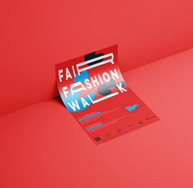


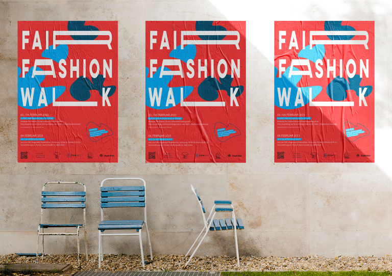
It was a walking tour through the streets of Cologne to discover fair fashion and to support these boutiques sustainably. I was immediately a fan of this event and was happy to create a design, which stands out from other posters in the cityscape and makes you want to read it and become part of this event.
Graphic Design
Social Media Design
What I've created:
Poster Design
Social Media kit
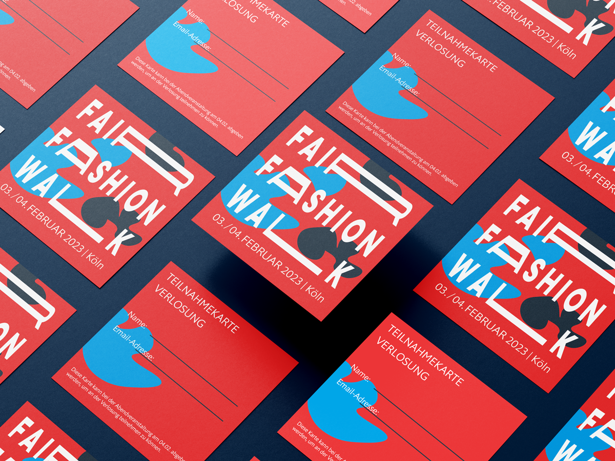
Ticket Design
BRIEFING
Create a Poster for a modern sustainable fashion event. It has to stand out from the mass of posters in the city. Also include the CI colours and mix it with other colours which match well together. And generate more participants then previous year.
MY Design Vision
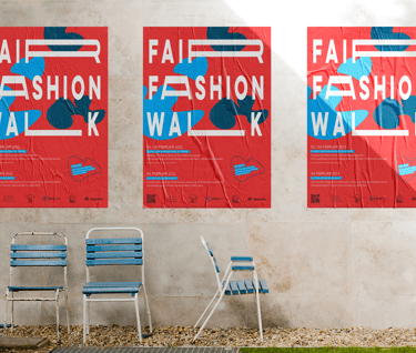
My visual starting point was the title of the event. I wanted to catch the attention of the viewer. I chose red as the main colour because it is an active colour, which automatically draws attention to itself with an ease, this was a great colour combo by using cyan (blue) to their Corporate Identity. The typography you see is manually distorted by me. This distortion is an illusion to walking - the distance you walk together. At the same time, this distortion looks dynamic and in motion. The red provided a great base for a strong typography, which at the same time appeared to be floating. By using floating elements, right weight of the text sizes - as it is very informative. I was able to grasp the viewers attention and this reflected back to the turn up of the event in comparison to the year prior. This makes me as a designer very proud and I am pleased by the results.
Outcome & benefits
This project is a great example why Design is so important. As many associate design being "just pretty" on the contrary I was able to communicate important information of the event, which then led to high numbers of visitors arriving. This was established through a well thought out concept by using distortion, weight and Layout - as I created an eye catching typography of the clients event name, which sparked the curiosity of viewers which instantly led to reading the informative text which was incorporated in this poster design. This led to a higher number of visitors attending in comparison to the year prior.


